Tone of Voice | Brand Identity | Website Design | Illustrations
Choice Voting
Choice Voting approached us to create a brand for his existing online voting business. His vision is to become the ‘go-to’ place for all online voting.
The strategic challenge
Making democracy feel approachable
What we did: Tone of voice · Brand identity · Website wireframes · Illustration
The design challenge
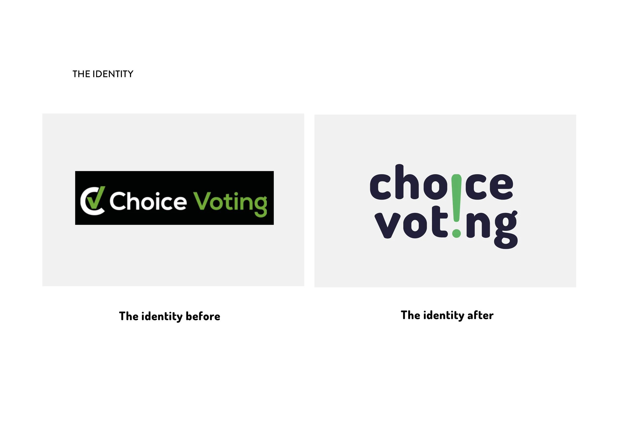
Voting should feel like something anyone can do. But when the platform behind it looks and feels like enterprise IT software, it sends an unconscious signal: this isn't for you.
Choice Voting had a genuinely powerful product — a digital voting platform born out of a real frustration with paper ballots that excluded people through sheer inconvenience. Twenty years on, the vision was bigger: to become the go-to platform for any vote, anywhere. A general election or a golf club AGM. A student union rep or a national referendum. The technology was there. The brand wasn't.
What we solved
The client understood code. Our job was to help him understand that design is also a language, and that the visual and verbal signals his platform sent were quietly telling people it wasn't built for them.
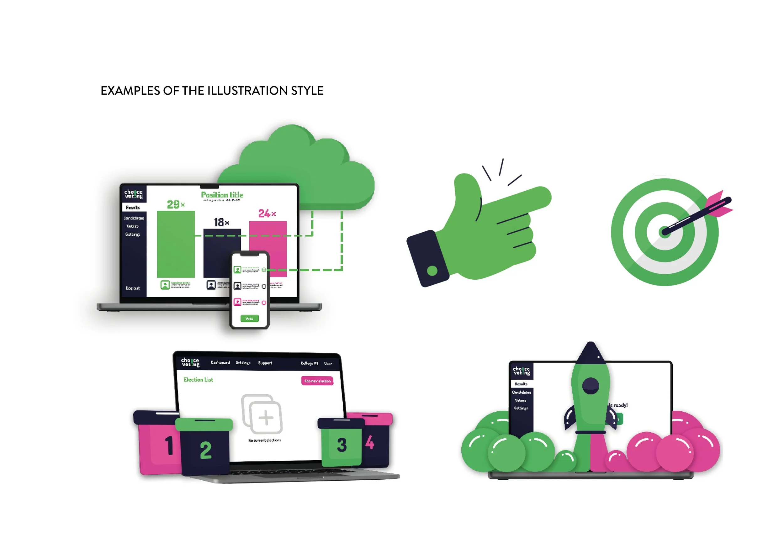
We started with the values. The core proposition was simple: signing up should be easy. Effortless, even. So we looked for the visual language of lightness - clouds, feathers, things that float and bounce - and let that become the design framework. Not decoration, but direction. Every icon, every illustration, every animation was designed to carry that feeling: that this process is light, this is simple, this is for you.
Tone of voice came next, because before any visual decision could land, the brand needed to know how to speak. Confident but not bureaucratic. Clear but not simplistic. Warm enough for a members' secretary in a village hall, robust enough for an official electoral body.
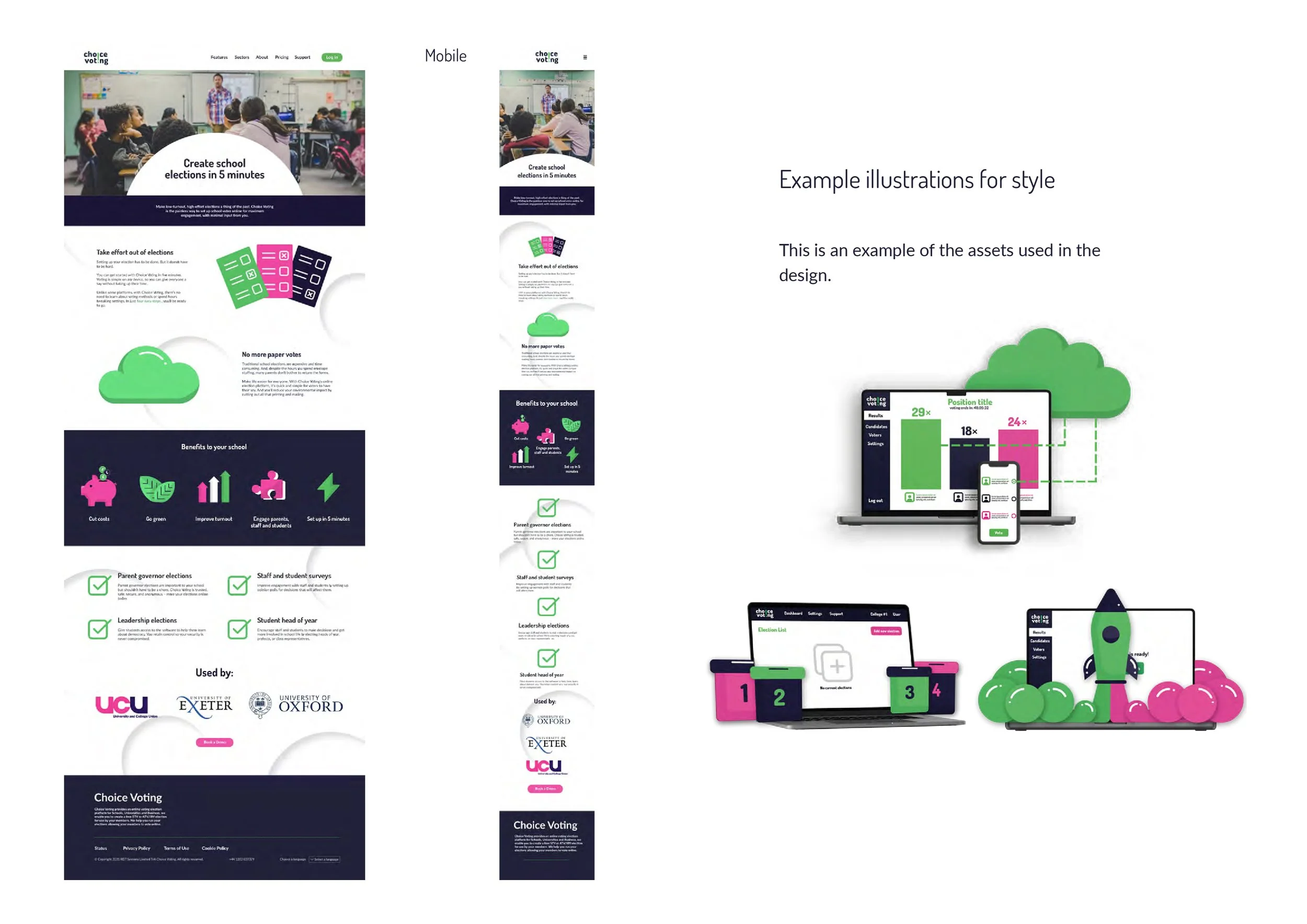
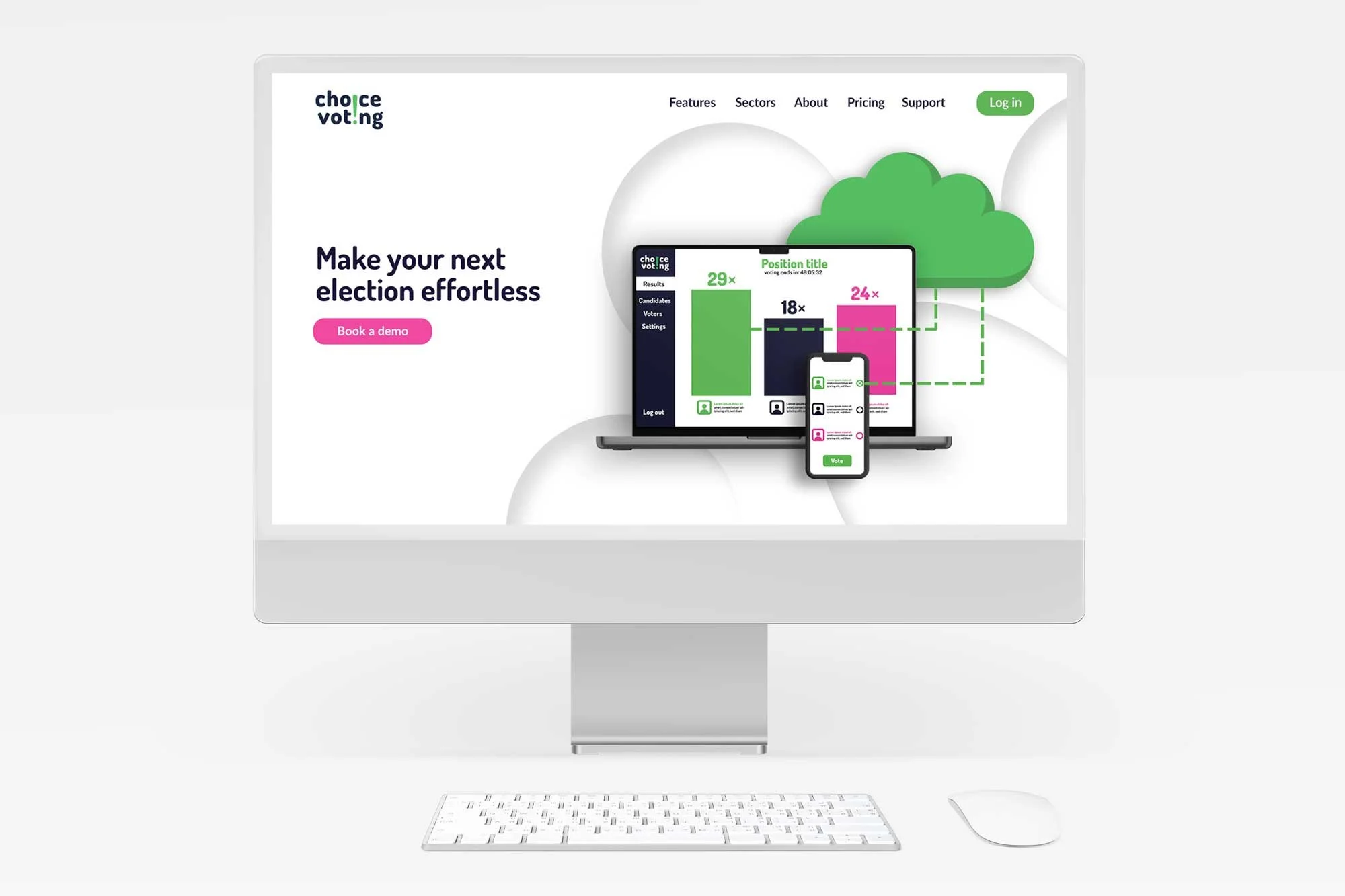
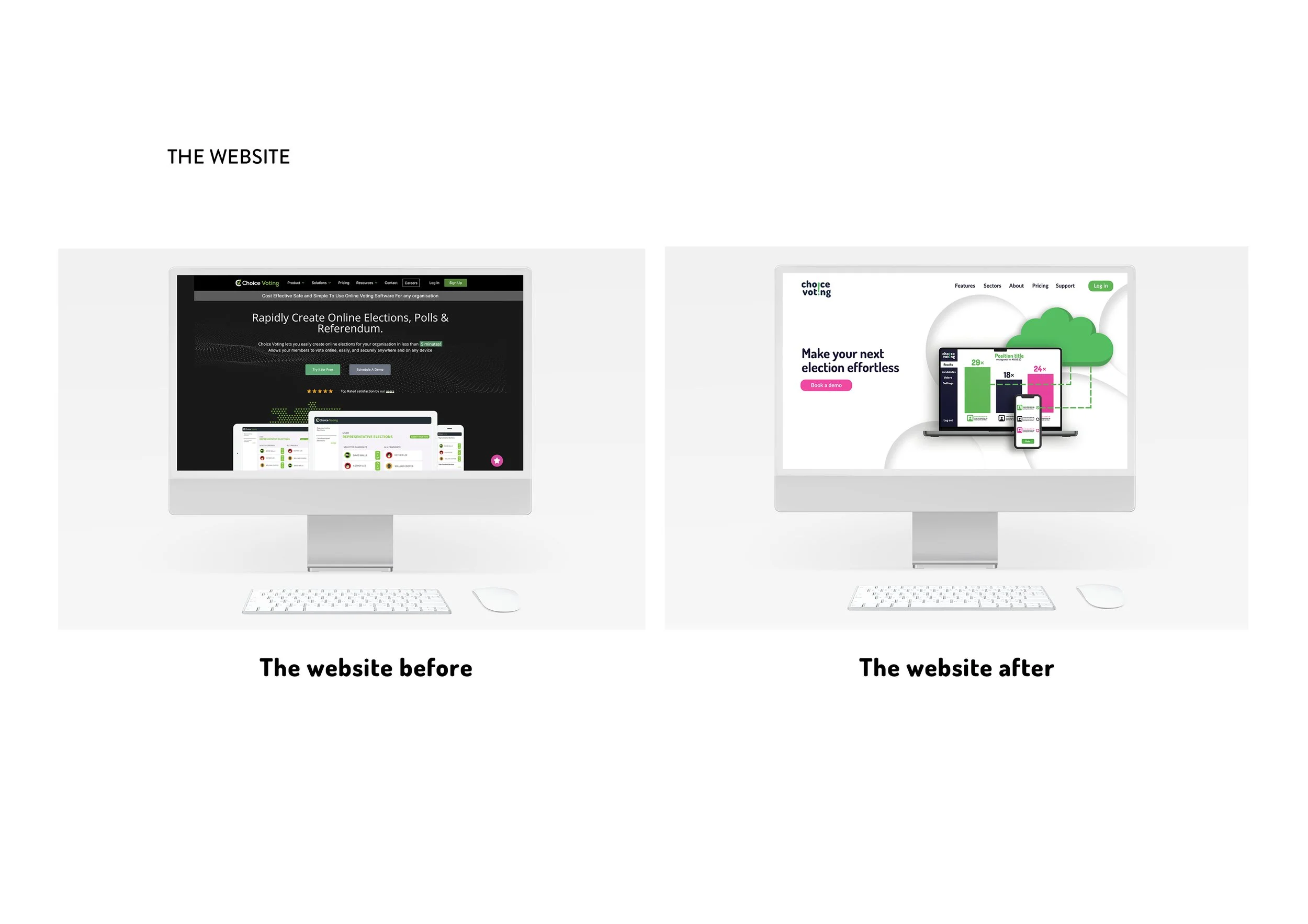
The Digital Application
We designed the website around the user journey, working out the initial look and feel before a single page was built. We collaborated with the writers so we had words to design to, then created wireframes in Adobe XD — giving Jason a clear visual framework to build from himself.
The page design files, illustrations and icons were all supplied to Jason to guide the build. The site is still ongoing, but you can see the designs illustrated here.